Role: Product Manager
Organisation: Victoria and Albert Museum
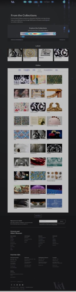
The Explore the Collections landing page is the V&A’s digital front door to over 1.5 million objects. I led the redesign to help users discover, understand, and explore the collection more intuitively, turning a static list page into an inspiring starting point for exploration.

Problem to solve
I used analytics (GA4, Hotjar), user mode research, and stakeholder insights to build a shared understanding of user needs and pain points. This showed a clear divide between modes — Study users valued functional search, while Discover and Ideate users needed visual entry points, curation, and stories to feel guided.
Discovery revealed that 79% of Explore the Collections sessions began directly on object pages via Google, while only 8.5% began on the landing page, showing that the page wasn’t serving as an entry point for most users. Although engagement time was strong (3m28s on average), scroll data showed that key content, including featured collections, wasn’t seen by most users.
Approach
The project began with an alignment workshop, I designed it to align the many stakeholders across content, design, curatorial, and digital teams and aimed to get consensus on exactly what this page should be doing.
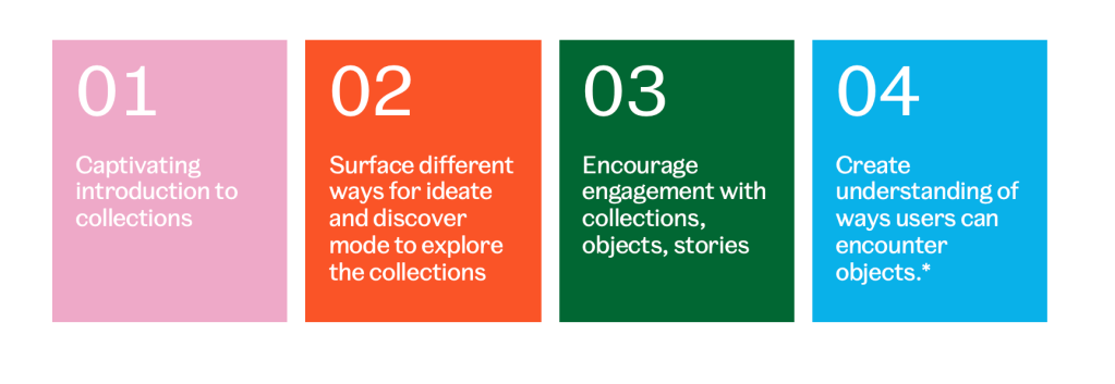
Together, we revisited the goals of Explore the Collections and redefined the role of the landing page within that ecosystem. We agreed – the landing page for Explore the Collections should:
- Serve primarily as an introduction to the V&A Collections
- Surface different ways for users to browse and search the collections.
- Encourage engagement with the Collections, Object and with stories.
- Help users understand the various ways they can encounter and interact with an object in the museum’s collection.
So,
- How might we introduce what the collections are?
- How might we facilitate exploration?
- How might we encourage engagement with objects and stories?
- How might we help users understand where objects are, physically and digitally?
An ideation session surfaced clear alignment around creating a rich, editorially driven experience that communicates the breadth and relevance of the collections, while secondary themes highlighted the value of research depth and linking digital experiences to physical visits. I used this alignment to map user needs across our three interaction modes:
- Discover: A welcoming introduction surfacing key collections, helping visitors orient and explore.
- Ideate: A visually rich space with thematic prompts and curated entry points to inspire creativity.
- Study: A streamlined pathway into advanced search and deep research.
From this foundation, I defined core goals to guide the redesign:
- Make a strong first impression. Clearly communicate what the collection is and why it matters through text and imagery, links.
- Support open-ended exploration. Offer ways in for those unsure what to look for and not just a search bar.
- Surface editorial stories, context, and unexpected connections.
- Show physical links to what’s on display or available by appointment.
These principles shaped both the structure and tone of the new page, from its visual hierarchy to the interaction design.
What we did
The result is a refreshed experience that feels open, inspiring, and intuitive. The page now opens with a welcoming editorial hero area, highlighting objects, themes, and stories in a way that offers inspiration without overwhelming.
Visitors can move seamlessly between multiple ways to explore, whether through search, thematic groupings, editorial articles, or individual objects, reflecting the reality that no two users take the same path.
A rich editorial carousel brings stories and themes to the forefront, encouraging serendipitous discovery and emotional connection, while a redesigned thematic scroller provides intuitive entry points into From the Collections topics such as Architecture, Jewellery, and Fashion.
To connect digital and in-gallery experiences, ‘On display’ tags and gallery location data have been added to object cards. The design also supports the launch of the Order an Object service, which enables visitors to request access to objects for study or research.
Outcomes
Five months after launch (April–September 2025), results show the redesign delivered clear gains in reach and engagement:
- Traffic up 40% year-on-year, with stable share of total site visits despite record site-wide growth
- Average engagement time up 24%, showing visitors stay longer through richer visuals and carousels
- Views per session up 2.3%, and more visitors scrolling further — +20% reaching 25% depth, +7% reaching 50%
- Carousel interactions high – achieving an average of 11.3% CTR and average post-click engagement of 5m49s, with over 20 views per session
- Tabs adopted by 22% of visitors, with strong performance in categories like Fashion and Theatre & Performance (30–40% content click rate)
- Search reliance dropped 32%, suggesting faster discovery through the new content design
The new landing page successfully re-establishes Explore the Collections as a destination for curiosity, creativity, and research, making the V&A’s digital collection more discoverable and inspiring to millions.
For a deeper look at the design rationale and behind-the-scenes collaboration, see my full write-up on the V&A Digital blog.
