Project: V&A East Storehouse Lookup
Role: Product Manager
Organisation: V&A
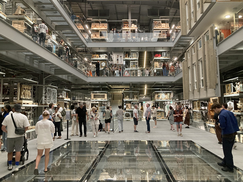
V&A East Storehouse is a new public museum space within the former London 2012 Olympics Media Centre at Queen Elizabeth Olympic Park. Designed like a vast warehouse, it offers visitors unprecedented behind-the-scenes access to objects traditionally held in storage. It opened in May 2025 to high acclaim, offering a truly “one of a kind” experience of objects in the collection.
Lookup is the digital companion developed by the V&A’s Digital Media team to complement the physical experience — a web-based tool enabling visitors to browse, explore, and connect with objects without interrupting the serendipity of the space.

The challenge
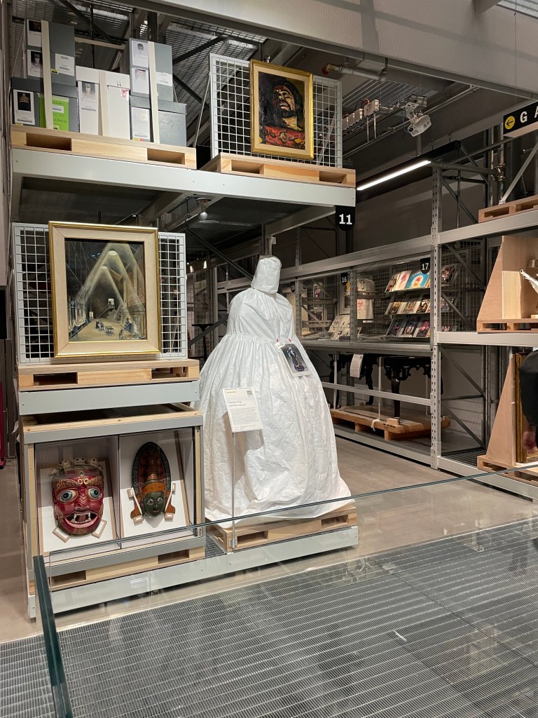
The Storehouse holds 250,000 objects, 350,000 books and 1,000 archive items — all displayed as they are stored, lightly curated and visible from all angles. The aim was to create a free, self-guided experience that emphasises browsing, discovery, and personal connections rather than a heavily curated narrative. To reinforce this serendipitous, “cabinet of curiosities” intent, no physical labels were added to the storage displays. Walking around the empty space months before opening, it felt a little bit like walking around an IKEA, very distinct from a traditional museum experience.
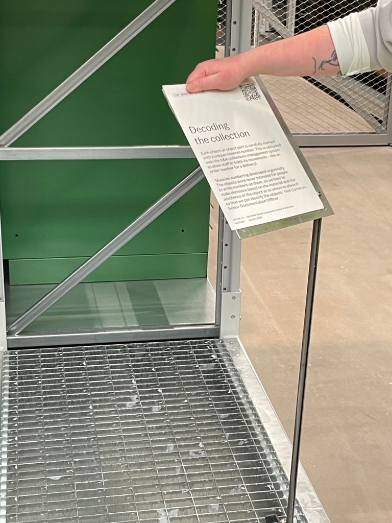
Despite this, there was still a need to provide visitors with some form of interpretation experience at Storehouse. While there would be large print guides, there would only be 10 per level. So, the Digital Media team were tasked with developing a digital solution. This would need be a way to see a full listing of objects across the Storehouse, top level object information and some explanation around the themes and topics underpinning the curation.

The digital solution needed to:
- Offer top-level object information and context for each display
- Be accessible instantly via QR codes, with no app download
- Load quickly and work reliably within variable Wi-Fi conditions
- Complement, not compete with, the physical experience


Approach
Working with the Digital Media, Curatorial, and Interpretation teams, I helped define the principles for Lookup: contextual, lightweight, and intuitive. It was never intended to be a guide or navigation tool, but a quiet layer of interpretation that supported curiosity in the space.
QR codes were identified as the most suitable entry point, but with constraints. they could not be placed on glass, their positioning was limited, and each code had to serve an entire display or level rather than individual objects. The team had little control over how the codes were physically displayed in the space, there would be one QR code on Level 1 only, for instance, and on the remaining floors they would link to an entire storage display rather than individual objects. The solution needed to account for this. They could not be placed on the glass balustrades, which limited positioning options.
Another key question was what the QR codes should link to. A third-party app was considered but quickly ruled out. Requiring visitors to find, download, log in, and learn to navigate an app added too many barriers. The team was aware that when multiple steps are involved, engagement drops sharply, with third party app adoption rates often as low as 2 to 6 percent. This meant the digital solution had to be accessible via a URL, quick to load, and light on data, reducing the risk of performance issues.
Finally, the team needed to set realistic expectations for uptake. Drawing on past exhibition data, where QR code usage averages 8–10%, and recognising that this was something completely new, we set our benchmark at that 10%.
So we designed the following Lookup experience to bring together:
- Homepage for easy orientation
- Topic pages introducing each storage display, with thematic context
- Object listings that surface key details and links to Explore the Collections
- Lightweight navigation across levels to mirror the Storehouse’s layout

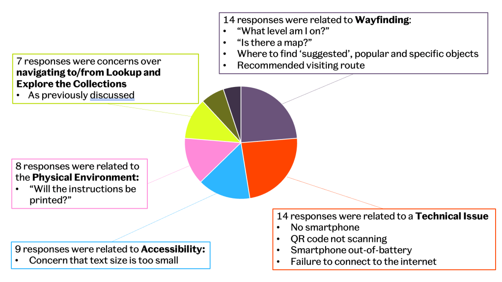
To test usability before launch, we conducted a moderated qualitative study. As the Storehouse was still under construction, we recreated it in a large meeting room at the V&A in South Kensington, using printed images of displays to simulate the visitor journey. We tested with newly recruited Front of House staff, representing first-time visitors, to understand how people would discover and use Lookup in context. Here are some of the concerns that came out from findings (put together by our UXRer Will Cash):

Challenges
The main ongoing challenge is Wi-Fi reliability, as usage depends on network connectivity. We’re working with Front of House and technical teams to improve access and guide visitors through connection steps.
We’ve also identified design improvements, adding a search function, refining navigation between levels, and optimising QR legibility on labels.
Outcomes
Since opening in May 2025, the Lookup has exceeded expectations.
On opening weekend alone, the Storehouse welcomed 7,000 visitors, with Lookup engagement at 39% uptake — far above our 8–10% benchmark.
- 223,000+ visits to Storehouse and 86,000 Lookup sessions
- Over 48,000 users — around 25% of total visitors engaging with the tool
- QR codes drive 41% of traffic, with most scans linking directly to Storage Display pages
- Average session time of 11 minutes, with 2 minutes active engagement — showing that visitors keep the page open as part of their visit
- Top clicked objects include the double bass, Moulton bicycle, guitars, and giraffe piano — reflecting strong curiosity-led use
All stats from data taken between May and September 2025.
The Lookup has redefined digital interpretation at the V&A: subtle, supportive, and rooted in curiosity. It extends the spirit of open storage beyond the physical, helping visitors connect with objects, and ideas, in their own way.