Project: Object page UX
Role: Product Manager
Organisation: V&A
The object page is the foundation of Explore the Collections — the public-facing interface for over a million records catalogued in Index+, the museum’s collections management system. It supports a wide spectrum of users, from those conducting deep research to those browsing out of curiosity. The object page brings together data, imagery, and context from multiple departments, making it a complex, collaborative interface designed to meet many needs at once.
Problem to solve
As the single most-visited template on Explore the Collections, the object page carries the weight of the entire user experience. It’s where the V&A’s collections, data, imagery, and stories meet, but it was showing signs of strain.
While the 2021 design remained elegant and functional, user behavior, data models, and institutional priorities had evolved.
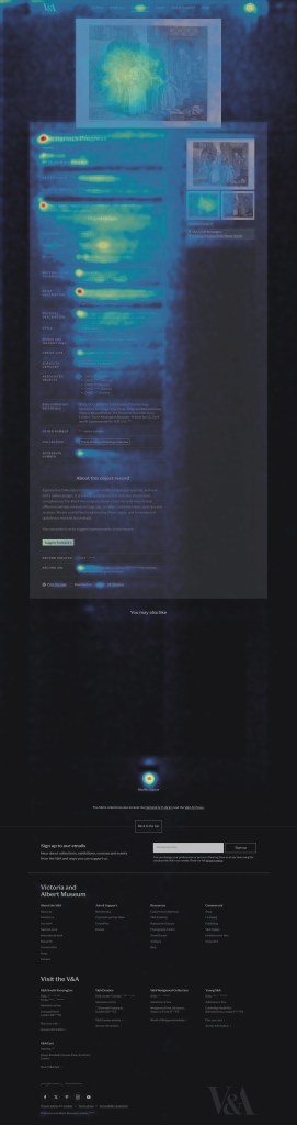
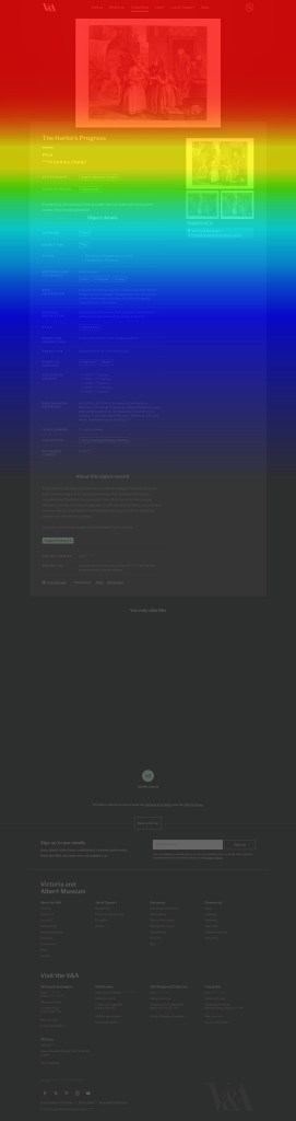
Analytics revealed that although average engagement time exceeded three minutes, most interaction occurred near the top of the page — around the hero image and introductory metadata. Lower sections saw significant drop-off, indicating that interest was high but attention waned without clear visual or contextual cues. The metadata on these pages is long and flat. There is no distinction between essential information, such as the title, maker, and materials, and more technical details like acquisition history or production notes. This makes the content harder to scan, and visitors who are browsing casually can quickly feel overwhelmed.
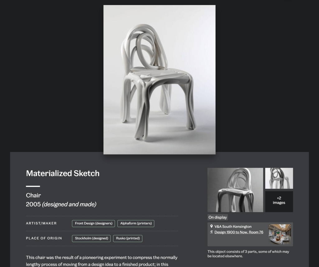
User research and data reinforced that images are the most important element of any object page, regardless of audience type. Yet image interactions were often missed: users didn’t always realize they could zoom or explore multiple views. On the Materialized Sketch Chair, for example, additional angles revealing its sculptural form sat much further down, disconnected from the main image, makes the experience a bit disjointed.
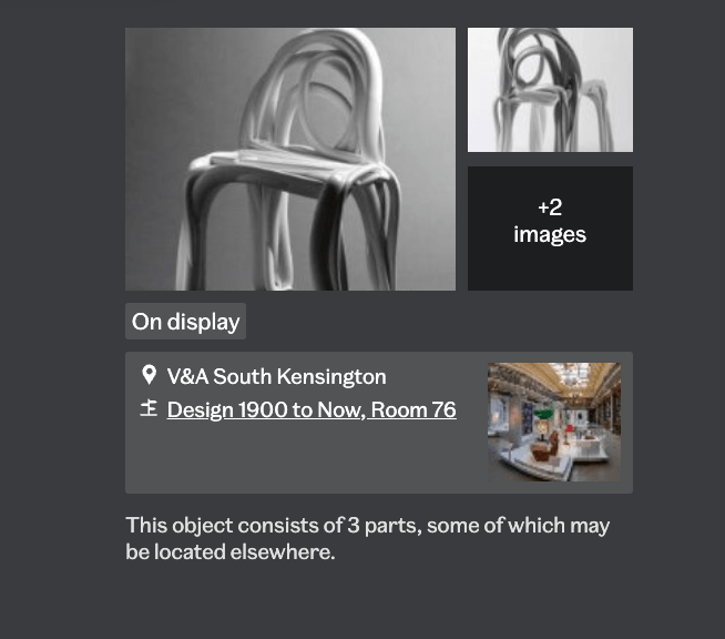
The side panel layout compounded this issue — clustering secondary images, display information, and calls to action together, resulting in visual density and weak hierarchy. Similarly, metadata was long and flat: essential details like title, maker, and materials were presented with equal weight as technical records, making it hard for casual visitors to scan or focus.
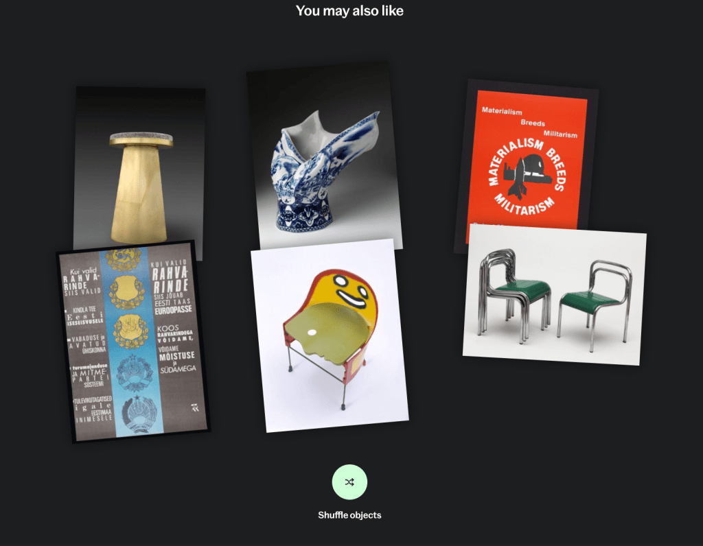
Meanwhile, the “You May Also Like” module relied on title keywords, producing erratic results that didn’t align with user intent or object context. Instead of supporting exploration, it sometimes confused users about relationships between objects.
Finally, there was a question of commercial integration: how could shop links or print purchases appear responsibly on object pages without compromising their research credibility? This balance between scholarship and commerce became a central design consideration.
Approach
I began by mapping known pain points and dependencies against my discovery across design, data, and technical systems — from how images are delivered through the API to how metadata is structured in Index+.
This became the basis of the design problem. How might we make the object page more engaging, meaningful, and navigable — without compromising its role as a research tool? We then developed and tested three lightweight prototypes to explore specific hypotheses:
• Image presentation: explored alternative layouts such as dual-column designs and tighter associations between main and secondary images.
• Information hierarchy: tested accordions and progressive disclosure to surface essential details while keeping in-depth metadata available for study-focused users.
• Onward journeys: experimented with redesigned recommendation modules that use tags and materials, rather than titles, to relate objects.
• Commercial integration: tested different levels of prominence for shop links — from subtle inline references to dedicated carousels — to gauge user perception and trust.
This project focused on structured discovery and user research to validate assumptions and define design direction for future development cycles. We tested two different layout concepts and several variations in detail and feature presentation through moderated sessions with “study mode” users. The aim was to understand whether changes to layout, hierarchy, and commercial integration influenced user experience.
UXR testing outcomes
Testing revealed no clear winner between layouts, but the double-panel design — featuring imagery on the left and collapsible metadata on the right — was often preferred. Participants appreciated the improved hierarchy and visibility of images but noted that it resembled e-commerce patterns, prompting mixed reactions about tone and context.
The refined single-column layout also performed well, particularly among users who valued continuity with the existing page. Both designs indicated a need for further testing to balance familiarity and clarity with a more image-led structure.
When introducing commercial links, users responded positively when these appeared contextually — within sections that also included articles or related objects. Integrations felt distracting when presented as standalone product rails or banners. Relevance proved critical: users accepted shop products when they were clearly connected to the object (e.g., custom prints or exhibition publications), but rejected unrelated items.
These findings suggest that future designs should:
- Prioritize visual hierarchy and flexible image-led layouts
- Embed commercial content contextually within onward journeys
- Select shop links based on relevance and narrative connection
The research provided practical, evidence-based insights to guide the next iteration of Explore the Collections object pages — balancing scholarship, usability, and responsible commercial opportunity.
 Meaghan Curry