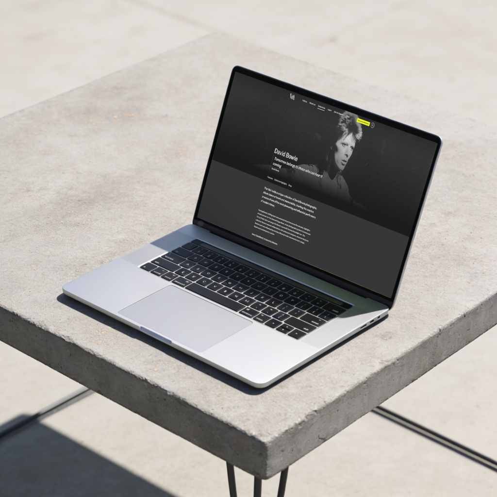
Internally, we began referring to this gap as the “Bowie Challenge.” In theory, a visitor should be able to find a wide range of Bowie-related material easily. In practice, there was no straightforward path between relevant From the Collections pages, Explore the Collections search, the Archives, or the Shop from a google search to the V&A website.
Through discovery, I also identified a strong commercial intent among users on these pages – a significant proportion were navigating directly to the shop. This insight revealed a missed opportunity to better surface relevant commercial links and products, aligning editorial content more closely with user behavior and business goals.
“The Bowie Challenge” highlighted how thematic pages functioned as silos rather than as part of an interconnected discovery layer. The refresh therefore set out to transform From the Collections into a network of editorially guided starting points, places where stories, objects, and ideas could link naturally, helping users follow their curiosity across the breadth of the V&A’s holdings.
Approach
Here was an opportunity to evolve From the Collections from a set of themed highlights into an interconnected discovery experience that made better use of the V&A’s rich offer. From discovery and cross-team workshops, I defined a set of product principles to guide design and content decisions for the refresh. These principles ensured the From the Collections pages not only looked cohesive but functioned as a connected, scalable discovery layer across the site.
For the From the Collections refresh, I established three guiding principles that shaped the design, content model, and delivery. These ensured the pages could evolve sustainably while creating a richer, more connected user experience.
1. Curious discovery
Each page needed to encourage onward journeys. Helping users move fluidly between themes, objects, and stories. This informed the introduction of mid-scroll onward journeys, related content carousels, and consistent cross-linking to Explore the Collections, What’s On, and the Shop.
2. Flexibility through structure
Empower editors to tell stories dynamically while maintaining system integrity. The new modular template in Tycho enabled flexibility in editorial layout, with structured metadata, multiple promo blocks, and dynamic imagery ensuring each page could adapt in tone and emphasis while staying cohesive across 80+ themes.
3. Align user and business intent
Use real user data to balance storytelling with value creation. Discovery showed strong commercial intent, with users frequently navigating to the Shop. The refresh surfaced relevant commercial and related links contextually, turning curiosity into conversion without interrupting the editorial experience.
What we did
Within this framework, and working alongside design and technology, the refreshed From the Collections pages introduced:
- A cleaner, modular design, aligning with the new Explore the Collections visual system
- Improved SEO structure, using consistent metadata and cross-linking to related themes and objects
- Template update, allowing multiple promotional blocks to be added in Tycho (CMS) to promote multiple types of content
- Refreshed hero area: Simplified the layout by removing the two-panel design, location label, and low-performing “Read more†link — surfacing all introductory text upfront to reduce friction and improve clarity. Introduced a sub-navigation component to support orientation and help users move easily between sections, enhancing overall engagement with page content.
- Editorial framing: Introduced clear editorial framing at the top of each page to highlight featured stories and establish a strong thematic focus. This framing sets context early, helping users understand the narrative intent and supporting onward journeys through related content and objects
- Shop carousel: Introduced a dynamic shop carousel to replace the static banner, surfacing relevant products contextually within each theme.
The refreshed From the Collections now acts as a bridge between editorial storytelling and collection data, visually richer, more discoverable, and easier to maintain.
For a deeper look at the design rationale and editorial approach, see my full write-up on the V&A Digital blog.