Tag: V&A

  • Connecting stories, themes and objects: Better onward journeys

    Project: From the Collections Refresh
    Role: Product Manager
    Organisation: V&A

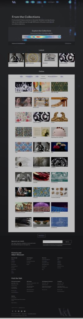
    The V&A’s collection tells countless stories, from the revolutionary artistry of Mary Quant, to the intricate craftsmanship of medieval textiles. The From the Collection pages have served as gateways to these narratives, offering curated explorations of key figures, themes, and movements that define our collection.

    From the Collections pages linked from the new Explore the Collections landing page

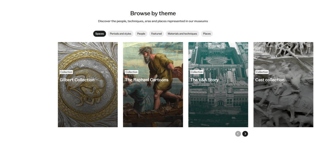
    The refresh of these 80+ pages marks an exciting evolution in how we share stories behind the V&A’s collection with audiences. I led the product direction and delivery of the refresh, collaborating with content, UX, and development to align visual design and editorial strategy.

    Problem to solve

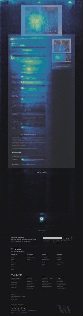
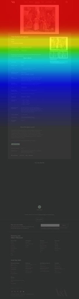
    Using the momentum of the opening of the David Bowie Centre in September 2025, I used Bowie as a thought experiment to test how a visitor might explore a topic on the V&A website. A search for David Bowie from a search engine would feature the David Bowie From the Collections page in the top 4 organic search results. These pages performed really well in search already, the V&A has great search authority and great SEO equity.

    But once users arrived, onward journeys were limited and content was siloed.

    Internally, we began referring to this gap as the “Bowie Challenge.” In theory, a visitor should be able to find a wide range of Bowie-related material easily. In practice, there was no straightforward path between relevant From the Collections pages, Explore the Collections search, the Archives, or the Shop from a google search to the V&A website.

    Illustrating the number of content types available across vam.ac.uk.

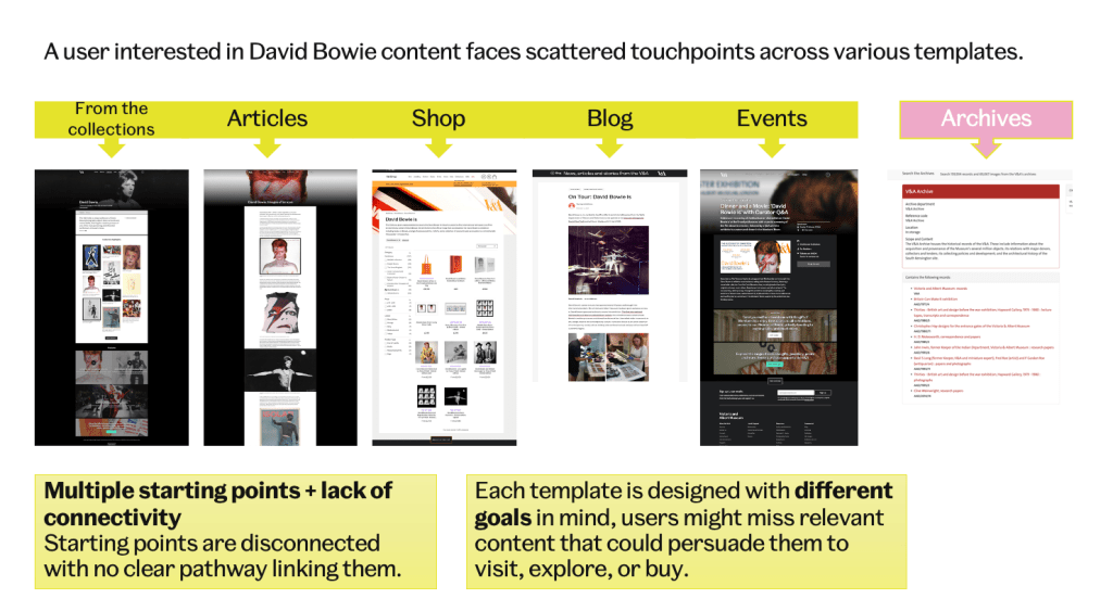
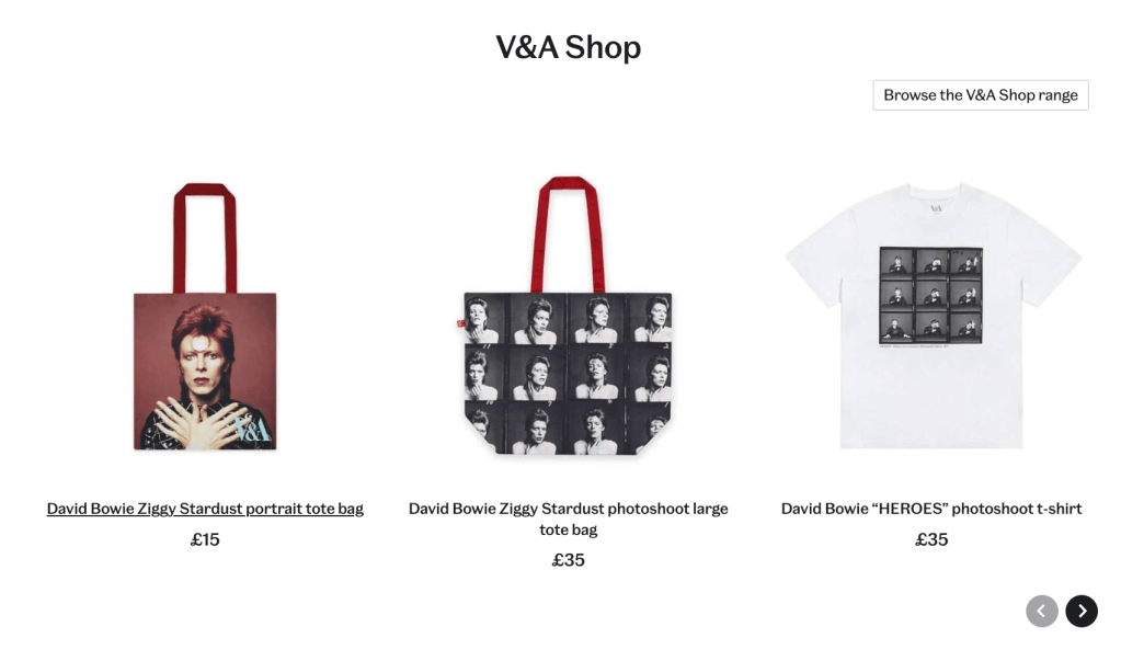
    Through discovery, I also identified a strong commercial intent among users on these pages — a significant proportion were navigating directly to the Shop. This insight revealed a missed opportunity to better surface relevant commercial links and products, aligning editorial content more closely with user behavior and business goals.

    Click data taken from Hotjar [January 2025]

    This “Bowie Challenge” became shorthand for a broader problem: the site wasn’t connecting its content meaningfully. It highlighted how thematic pages functioned as silos rather than as part of an interconnected discovery layer. The refresh therefore set out to transform From the Collections into a network of editorially guided starting points, places where stories, objects, and ideas could link naturally, helping users follow their curiosity across the breadth of the V&A’s holdings.

    Approach

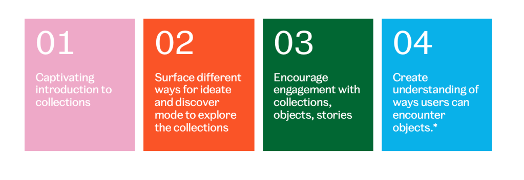
    As Product Manager, I framed the “Bowie Challenge” as an opportunity to evolve From the Collections from a set of themed highlights into an interconnected discovery experience that made better use of the V&A’s rich offer. From discovery and cross-team workshops, I defined a set of product principles to guide design and content decisions for the refresh. These principles ensured the From the Collections pages not only looked cohesive but functioned as a connected, scalable discovery layer across the site.

    For the From the Collections refresh, I established three guiding principles that shaped the design, content model, and delivery. These ensured the pages could evolve sustainably while creating a richer, more connected user experience.

    1. Curious discovery

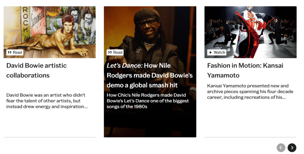
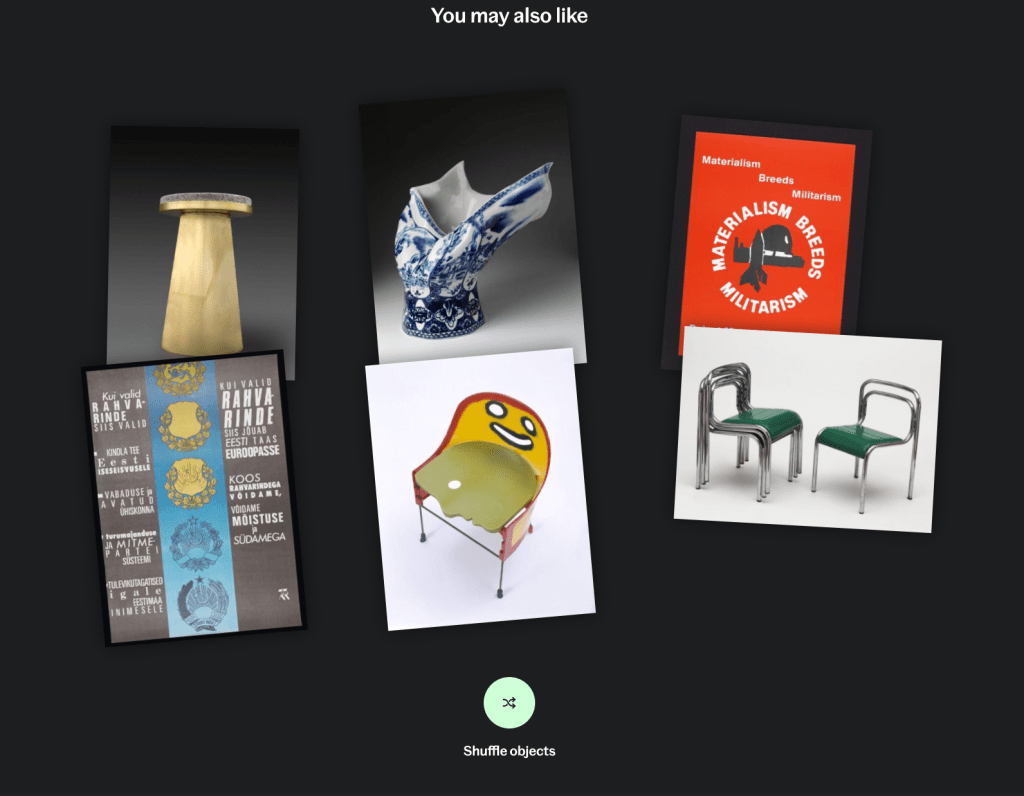
    Each page needed to encourage onward journeys — helping users move fluidly between themes, objects, and stories. This informed the introduction of mid-scroll onward journeys, related content carousels, and consistent cross-linking to Explore the Collections, What’s On, and the Shop.

    2. Flexibility through structure

    Empower editors to tell stories dynamically while maintaining system integrity. The new modular template in Tycho enabled flexibility in editorial layout, with structured metadata, multiple promo blocks, and dynamic imagery ensuring each page could adapt in tone and emphasis while staying cohesive across 80+ themes.

    3. Align user and business intent

    Use real user data to balance storytelling with value creation. Discovery showed strong commercial intent, with users frequently navigating to the Shop. The refresh surfaced relevant commercial and related links contextually, turning curiosity into conversion without interrupting the editorial experience.

    What we did

    Within this framework, and working alongside design and technology, the refreshed From the Collections pages introduced:

    • A cleaner, modular design, aligning with the new Explore the Collections visual system
    • Improved SEO structure, using consistent metadata and cross-linking to related themes and objects
    • Template update, allowing multiple promotional blocks to be added in Tycho (CMS) to promote multiple types of content
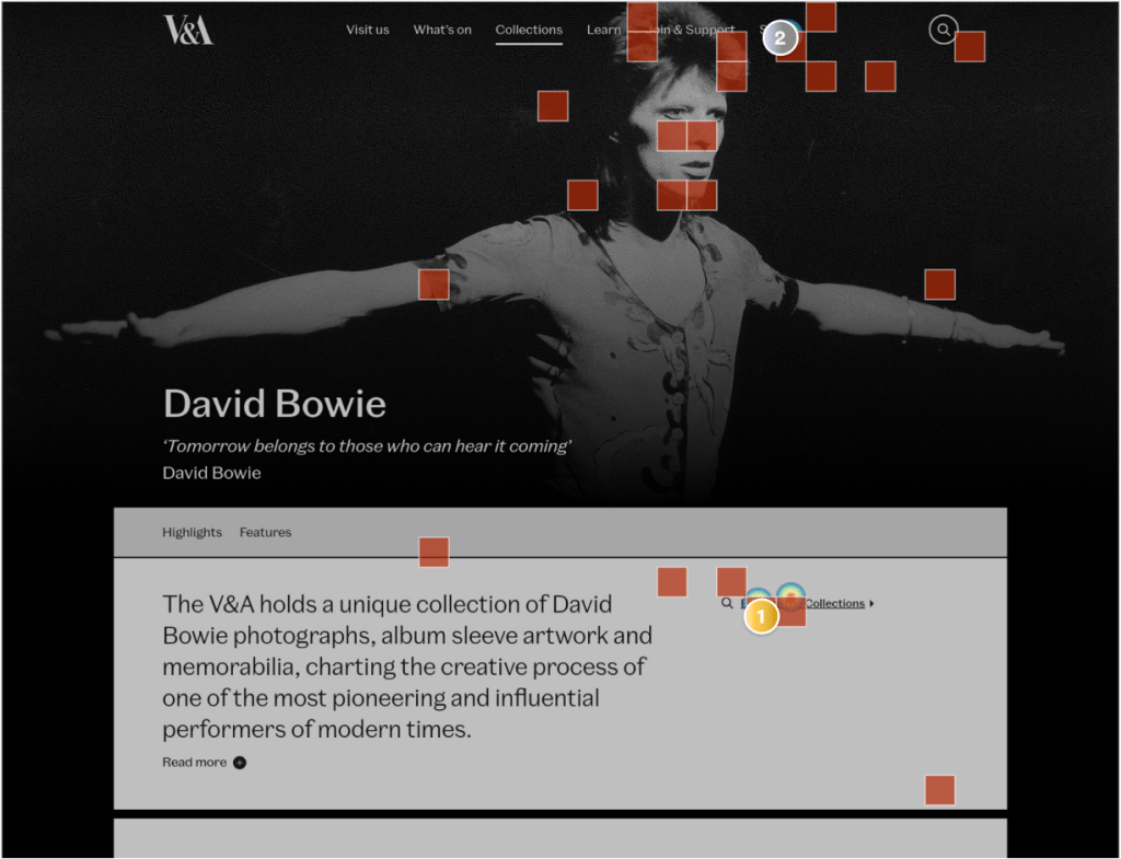
    • Refreshed hero area: Simplified the layout by removing the two-panel design, location label, and low-performing “Read more” link — surfacing all introductory text upfront to reduce friction and improve clarity. Introduced a sub-navigation component to support orientation and help users move easily between sections, enhancing overall engagement with page content.
    Refreshed banner (before and after)
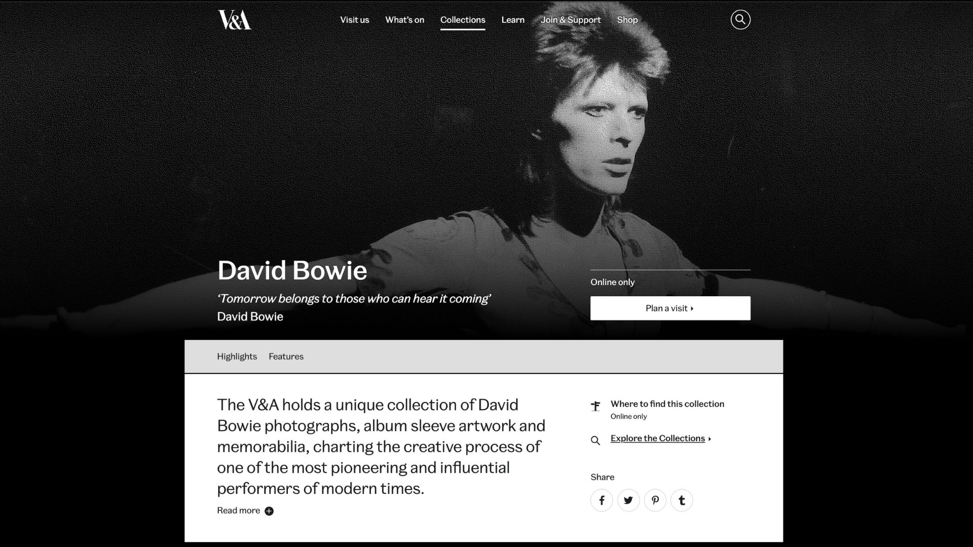
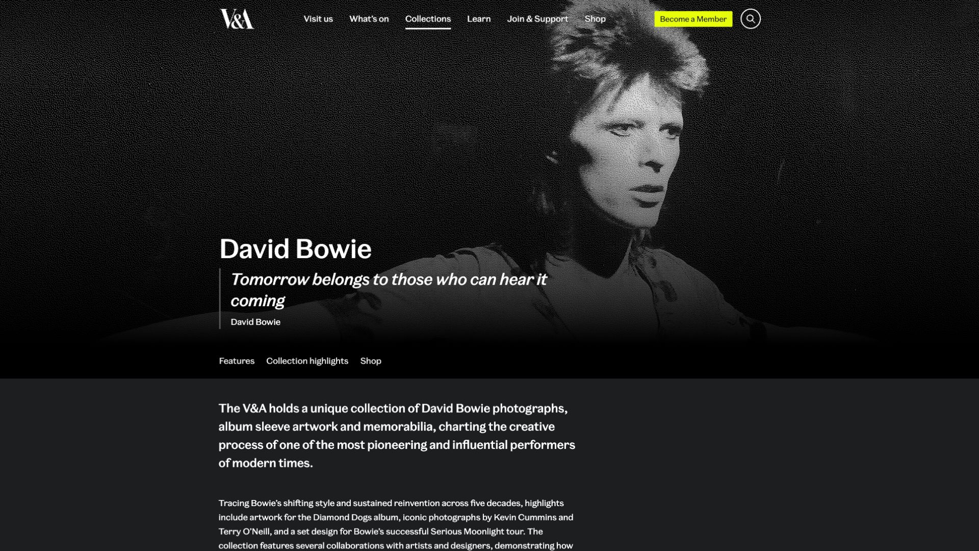
    • Editorial framing: Introduced clear editorial framing at the top of each page to highlight featured stories and establish a strong thematic focus. This framing sets context early, helping users understand the narrative intent and supporting onward journeys through related content and objects
    • Shop carousel: Introduced a dynamic shop carousel to replace the static banner, surfacing relevant products contextually within each theme.

    Outcomes

    Early results and qualitative feedback have been positive:

    • Onward journeys from From the Collections pages to object pages, What’s On, and Visit sections increased, with 5–6% of users moving directly into these pages. Engagement with featured carousels and curated blocks averages 26.8% CTR, demonstrating sustained curiosity and deeper exploration.
    • The new modular template has proven scalable, with 80+ refreshed pages consistently maintained through Tycho. Editors can now adapt layouts, imagery, and promotions easily while preserving UX and SEO consistency.
    • The introduction of the Shop Promo Carousel on the David Bowie page drove a 31× increase in engagement versus the previous static banner, a 1,375% rise in product clicks, and a 21.4% conversion rate from interactions to product clicks — clear evidence that surfacing commercial content contextually enhances both user satisfaction and revenue potential.

    The refreshed From the Collections now acts as a bridge between editorial storytelling and collection data, visually richer, more discoverable, and easier to maintain.

    For a deeper look at the design rationale and editorial approach, see my full write-up on the V&A Digital blog.

  • Rethinking how we explore objects

    Project: Object page UX
    Role: Product Manager
    Organisation: V&A

    The object page is the foundation of Explore the Collections — the public-facing interface for over a million records catalogued in Index+, the museum’s collections management system. It supports a wide spectrum of users, from those conducting deep research to those browsing out of curiosity. The object page brings together data, imagery, and context from multiple departments, making it a complex, collaborative interface designed to meet many needs at once.

    A screenshot taken from an object record for Materialized Sketch Chair, a cool chair I like.

    Problem to solve

    As the single most-visited template on Explore the Collections, the object page carries the weight of the entire user experience. It’s where the V&A’s collections, data, imagery, and stories meet, but it was showing signs of strain.

    While the 2021 design remained elegant and functional, user behavior, data models, and institutional priorities had evolved.

    Analytics revealed that although average engagement time exceeded three minutes, most interaction occurred near the top of the page — around the hero image and introductory metadata. Lower sections saw significant drop-off, indicating that interest was high but attention waned without clear visual or contextual cues. The metadata on these pages is long and flat. There is no distinction between essential information, such as the title, maker, and materials, and more technical details like acquisition history or production notes. This makes the content harder to scan, and visitors who are browsing casually can quickly feel overwhelmed.

    User research and data reinforced that images are the most important element of any object page, regardless of audience type. Yet image interactions were often missed: users didn’t always realize they could zoom or explore multiple views. On the Materialized Sketch Chair, for example, additional angles revealing its sculptural form sat much further down, disconnected from the main image, makes the experience a bit disjointed.

    The side panel layout compounded this issue — clustering secondary images, display information, and calls to action together, resulting in visual density and weak hierarchy. Similarly, metadata was long and flat: essential details like title, maker, and materials were presented with equal weight as technical records, making it hard for casual visitors to scan or focus.

    Meanwhile, the “You May Also Like” module relied on title keywords, producing erratic results that didn’t align with user intent or object context. Instead of supporting exploration, it sometimes confused users about relationships between objects.

    Finally, there was a question of commercial integration: how could shop links or print purchases appear responsibly on object pages without compromising their research credibility? This balance between scholarship and commerce became a central design consideration.

    Approach

    I began by mapping known pain points and dependencies against my discovery across design, data, and technical systems — from how images are delivered through the API to how metadata is structured in Index+.

    This became the basis of the design problem. How might we make the object page more engaging, meaningful, and navigable — without compromising its role as a research tool? We then developed and tested three lightweight prototypes to explore specific hypotheses:

    Image presentation: explored alternative layouts such as dual-column designs and tighter associations between main and secondary images.

    Information hierarchy: tested accordions and progressive disclosure to surface essential details while keeping in-depth metadata available for study-focused users.

    Onward journeys: experimented with redesigned recommendation modules that use tags and materials, rather than titles, to relate objects.

    Commercial integration: tested different levels of prominence for shop links — from subtle inline references to dedicated carousels — to gauge user perception and trust.

    This project focused on structured discovery and user research to validate assumptions and define design direction for future development cycles. We tested two different layout concepts and several variations in detail and feature presentation through moderated sessions with “study mode” users. The aim was to understand whether changes to layout, hierarchy, and commercial integration influenced user experience.

    UXR testing outcomes

    Testing revealed no clear winner between layouts, but the double-panel design — featuring imagery on the left and collapsible metadata on the right — was often preferred. Participants appreciated the improved hierarchy and visibility of images but noted that it resembled e-commerce patterns, prompting mixed reactions about tone and context.

    The refined single-column layout also performed well, particularly among users who valued continuity with the existing page. Both designs indicated a need for further testing to balance familiarity and clarity with a more image-led structure.

    When introducing commercial links, users responded positively when these appeared contextually — within sections that also included articles or related objects. Integrations felt distracting when presented as standalone product rails or banners. Relevance proved critical: users accepted shop products when they were clearly connected to the object (e.g., custom prints or exhibition publications), but rejected unrelated items.

    These findings suggest that future designs should:

    • Prioritize visual hierarchy and flexible image-led layouts
    • Embed commercial content contextually within onward journeys
    • Select shop links based on relevance and narrative connection

    The research provided practical, evidence-based insights to guide the next iteration of Explore the Collections object pages — balancing scholarship, usability, and responsible commercial opportunity.

  • Redesigning how millions discover the V&A’s collections

    Role: Product Manager
    Organisation: Victoria and Albert Museum

    The Explore the Collections landing page is the V&A’s digital front door to over 1.5 million objects. I led the redesign to help users discover, understand, and explore the collection more intuitively, turning a static list page into an inspiring starting point for exploration.

    Screenshot of the Victoria and Albert Museum's 'Explore the Collections' landing page featuring a dark background, a prominent search bar, and a central image of a person wearing a mask, symbolizing discovery in the museum's extensive collection.
    The V&A Museum’s redesigned landing page, featuring intuitive navigation to explore over 1.5 million objects.

    Problem to solve

    I used analytics (GA4, Hotjar), user mode research, and stakeholder insights to build a shared understanding of user needs and pain points. This showed a clear divide between modes — Study users valued functional search, while Discover and Ideate users needed visual entry points, curation, and stories to feel guided.

    Discovery revealed that 79% of Explore the Collections sessions began directly on object pages via Google, while only 8.5% began on the landing page, showing that the page wasn’t serving as an entry point for most users. Although engagement time was strong (3m28s on average), scroll data showed that key content, including featured collections, wasn’t seen by most users.

    Approach

    The project began with an alignment workshop, I designed it to align the many stakeholders across content, design, curatorial, and digital teams and aimed to get consensus on exactly what this page should be doing.

    Together, we revisited the goals of Explore the Collections and redefined the role of the landing page within that ecosystem. We agreed – the landing page for Explore the Collections should:

    1. Serve primarily as an introduction to the V&A Collections
    2. Surface different ways for users to browse and search the collections.
    3. Encourage engagement with the Collections, Object and with stories.
    4. Help users understand the various ways they can encounter and interact with an object in the museum’s collection.

    So,

    • How might we introduce what the collections are?
    • How might we facilitate exploration?
    • How might we encourage engagement with objects and stories?
    • How might we help users understand where objects are, physically and digitally?

    An ideation session surfaced clear alignment around creating a rich, editorially driven experience that communicates the breadth and relevance of the collections, while secondary themes highlighted the value of research depth and linking digital experiences to physical visits. I used this alignment to map user needs across our three interaction modes:

    • Discover: A welcoming introduction surfacing key collections, helping visitors orient and explore.
    • Ideate: A visually rich space with thematic prompts and curated entry points to inspire creativity.
    • Study: A streamlined pathway into advanced search and deep research.

    From this foundation, I defined core goals to guide the redesign:

    • Make a strong first impression. Clearly communicate what the collection is and why it matters through text and imagery, links.
    • Support open-ended exploration. Offer ways in for those unsure what to look for and not just a search bar.
    • Surface editorial stories, context, and unexpected connections.
    • Show physical links to what’s on display or available by appointment.

    These principles shaped both the structure and tone of the new page, from its visual hierarchy to the interaction design.

    What we did

    The result is a refreshed experience that feels open, inspiring, and intuitive. The page now opens with a welcoming editorial hero area, highlighting objects, themes, and stories in a way that offers inspiration without overwhelming.

    Visitors can move seamlessly between multiple ways to explore, whether through search, thematic groupings, editorial articles, or individual objects, reflecting the reality that no two users take the same path.

    A rich editorial carousel brings stories and themes to the forefront, encouraging serendipitous discovery and emotional connection, while a redesigned thematic scroller provides intuitive entry points into From the Collections topics such as Architecture, Jewellery, and Fashion.

    To connect digital and in-gallery experiences, ‘On display’ tags and gallery location data have been added to object cards. The design also supports the launch of the Order an Object service, which enables visitors to request access to objects for study or research.

    Outcomes

    Five months after launch (April–September 2025), results show the redesign delivered clear gains in reach and engagement:

    • Traffic up 40% year-on-year, with stable share of total site visits despite record site-wide growth 
    • Average engagement time up 24%, showing visitors stay longer through richer visuals and carousels 
    • Views per session up 2.3%, and more visitors scrolling further — +20% reaching 25% depth, +7% reaching 50% 
    • Carousel interactions high – achieving an average of 11.3% CTR and average post-click engagement of 5m49s, with over 20 views per session 
    • Tabs adopted by 22% of visitors, with strong performance in categories like Fashion and Theatre & Performance (30–40% content click rate) 
    • Search reliance dropped 32%, suggesting faster discovery through the new content design 

    The new landing page successfully re-establishes Explore the Collections as a destination for curiosity, creativity, and research, making the V&A’s digital collection more discoverable and inspiring to millions.

    For a deeper look at the design rationale and behind-the-scenes collaboration, see my full write-up on the V&A Digital blog.

  • In-gallery digital: Designing Lookup

    Project: V&A East Storehouse Lookup
    Role: Product Manager
    Organisation: V&A


    V&A East Storehouse is a new public museum space within the former London 2012 Olympics Media Centre at Queen Elizabeth Olympic Park. Designed like a vast warehouse, it offers visitors unprecedented behind-the-scenes access to objects traditionally held in storage. It opened in May 2025 to high acclaim, offering a truly “one of a kind” experience of objects in the collection.

    Lookup is the digital companion developed by the V&A’s Digital Media team to complement the physical experience — a web-based tool enabling visitors to browse, explore, and connect with objects without interrupting the serendipity of the space.

    Visitors exploring the open-storage experience at V&A East Storehouse on opening weekend, featuring diverse objects.

    The challenge

    The Storehouse holds 250,000 objects, 350,000 books and 1,000 archive items — all displayed as they are stored, lightly curated and visible from all angles. The aim was to create a free, self-guided experience that emphasises browsing, discovery, and personal connections rather than a heavily curated narrative.  To reinforce this serendipitous, “cabinet of curiosities” intent, no physical labels were added to the storage displays. Walking around the empty space months before opening, it felt a little bit like walking around an IKEA, very distinct from a traditional museum experience.

    Despite this, there was still a need to provide visitors with some form of interpretation experience at Storehouse. While there would be large print guides, there would only be 10 per level. So, the Digital Media team were tasked with developing a digital solution. This would need be a way to see a full listing of objects across the Storehouse, top level object information and some explanation around the themes and topics underpinning the curation.

    Here you can see a mini display or ‘hacked end’ with an assortment of objects on display.

    The digital solution needed to:

    • Offer top-level object information and context for each display
    • Be accessible instantly via QR codes, with no app download
    • Load quickly and work reliably within variable Wi-Fi conditions
    • Complement, not compete with, the physical experience
    An example of the type of labels the QR codes were positioned on.
    A label on a “hacked side”


    Approach

    Working with the Digital Media, Curatorial, and Interpretation teams, I helped define the principles for Lookup: contextual, lightweight, and intuitive. It was never intended to be a guide or navigation tool, but a quiet layer of interpretation that supported curiosity in the space.

    QR codes were identified as the most suitable entry point, but with constraints. they could not be placed on glass, their positioning was limited, and each code had to serve an entire display or level rather than individual objects. The team had little control over how the codes were physically displayed in the space, there would be one QR code on Level 1 only, for instance, and on the remaining floors they would link to an entire storage display rather than individual objects. The solution needed to account for this.  They could not be placed on the glass balustrades, which limited positioning options.

    Another key question was what the QR codes should link to. A third-party app was considered but quickly ruled out. Requiring visitors to find, download, log in, and learn to navigate an app added too many barriers. The team was aware that when multiple steps are involved, engagement drops sharply, with third party app adoption rates often as low as 2 to 6 percent. This meant the digital solution had to be accessible via a URL, quick to load, and light on data, reducing the risk of performance issues.  

    Finally, the team needed to set realistic expectations for uptake. Drawing on past exhibition data, where QR code usage averages 8–10%, and recognising that this was something completely new, we set our benchmark at that 10%.

    So we designed the following Lookup experience to bring together:

    • Homepage for easy orientation
    • Topic pages introducing each storage display, with thematic context
    • Object listings that surface key details and links to Explore the Collections
    • Lightweight navigation across levels to mirror the Storehouse’s layout
    Screenshots of the pages of Lookup.

    To test usability before launch, we conducted a moderated qualitative study. As the Storehouse was still under construction, we recreated it in a large meeting room at the V&A in South Kensington, using printed images of displays to simulate the visitor journey. We tested with newly recruited Front of House staff, representing first-time visitors, to understand how people would discover and use Lookup in context. Here are some of the concerns that came out from findings (put together by our UXRer Will Cash):

    Challenges

    The main ongoing challenge is Wi-Fi reliability, as usage depends on network connectivity. We’re working with Front of House and technical teams to improve access and guide visitors through connection steps.

    We’ve also identified design improvements, adding a search function, refining navigation between levels, and optimising QR legibility on labels.

    Outcomes

    Since opening in May 2025, the Lookup has exceeded expectations.

    On opening weekend alone, the Storehouse welcomed 7,000 visitors, with Lookup engagement at 39% uptake — far above our 8–10% benchmark.

    • 223,000+ visits to Storehouse and 86,000 Lookup sessions
    • Over 48,000 users — around 25% of total visitors engaging with the tool
    • QR codes drive 41% of traffic, with most scans linking directly to Storage Display pages
    • Average session time of 11 minutes, with 2 minutes active engagement — showing that visitors keep the page open as part of their visit
    • Top clicked objects include the double bass, Moulton bicycle, guitars, and giraffe piano — reflecting strong curiosity-led use

    All stats from data taken between May and September 2025.

    The Lookup has redefined digital interpretation at the V&A: subtle, supportive, and rooted in curiosity. It extends the spirit of open storage beyond the physical, helping visitors connect with objects, and ideas, in their own way.